rachel pollock design

Happy Camper
monthly journal publication for nature lovers
fall 2018 · 3 weeks · publication design
inspiration
From the time I was a little kid, I have been fascinated with nature. I remember going on “nature walks” with my grandmother. She’d tell me about the leaves and the clouds and we’d wave to the deer in her backyard. If the temperature was above 40 degrees, I was exploring the woods in my neighborhood. And if I wasn’t, I was playing in the snow. Nature brought out the best of my childhood imagination. In fact, some of my fondest childhood memories are of days spent. sunrise to sundown playing in a pile of sand.
Yep. a pile of sand off a river in Ontario, Canada entertained me for three whole weeks every summer. One day it was a zoo, another day it was a water park and sometimes it was an intricate system of caves waiting tobe explored. I’d collect rocks, sticks. cattails, shells, and whatever else I could find. I’d paint scraps of wood, given to us by the carpenter down the little dirt road leading up to our cabin. I’d swim in the river for hours, not afraid to tangle my feet in the seaweed - or even take the occasional mud bath.
At the end of the day, my family would roast s’mores around the campfire. And the best part was, no technology. Shoot, we didn’t even have indoor plumbing.
And it was great.
Happy Camper is a monthly journal meant to capture that spirit and offer a fresh perspective in the outdoor lifestyle publication sphere. It’s about embracing nature in your everyday life, whether you’re hiking in the Amazon or simply stopping to admire that tree you see every day on your way to work.
Project Process
research
& synthesis
exploration
feedback
& iteration
production
protoyping
& design
comp. analysis
content gather
affinity diagram
info architecture
flatplans
sketching
masthead
mood board
photography
illustration
typography
photo editing
type system
image treatment
visual language
test printing
design critique
editing
paper selection
proofing
printing
binding

content curation
& information architecture
I began the research process for this project by examining the structural schemas that govern magazine and journal publications.
Then, I gathered a wide range of content. I clustered this content on an affinity diagram to uncover patterns from which I could build my publication.
Ultimately, I decided to divide the publication into three sections: Features (which covers a wide range of nature-related topics), Way Out (which provides readers with tips. tricks, and advice for getting outside, from remote camping spots to urban outdoor adventures) and Outside In (which encourages readers to bring nature into their daily lives). I worked through several iterations of flat plans and thumbnail sketches until I found a structure conducive to the information I wanted to present.

typographic exploration
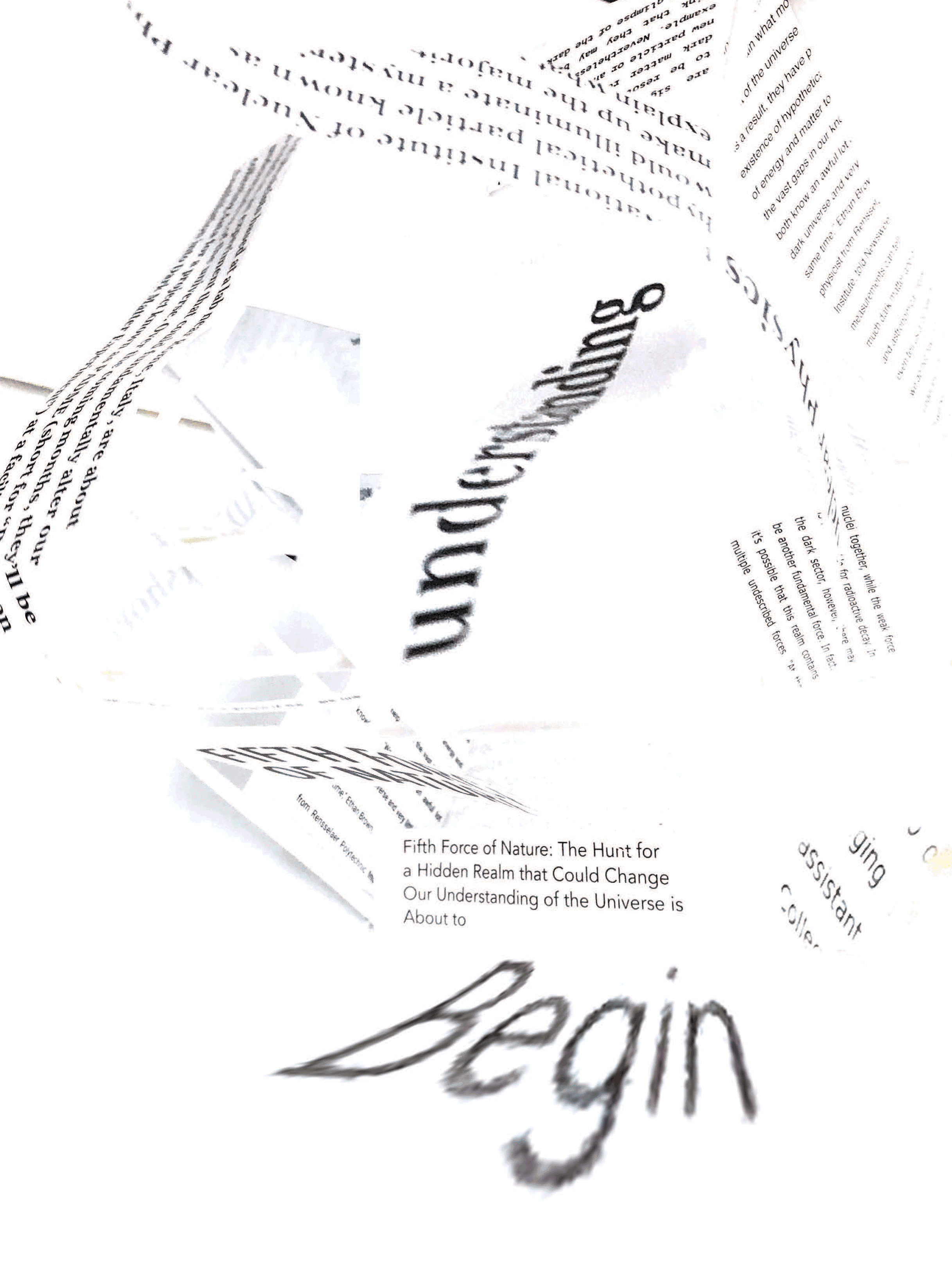
I really wanted to push myself to explore typography with this project. Before designing anything, I took some time to make a mess and push typography to its limits. I conducted studies in which I manipulated type in both 2D and 3D. Then photographed and edited my discoveries which I would reference later in the project’s development.
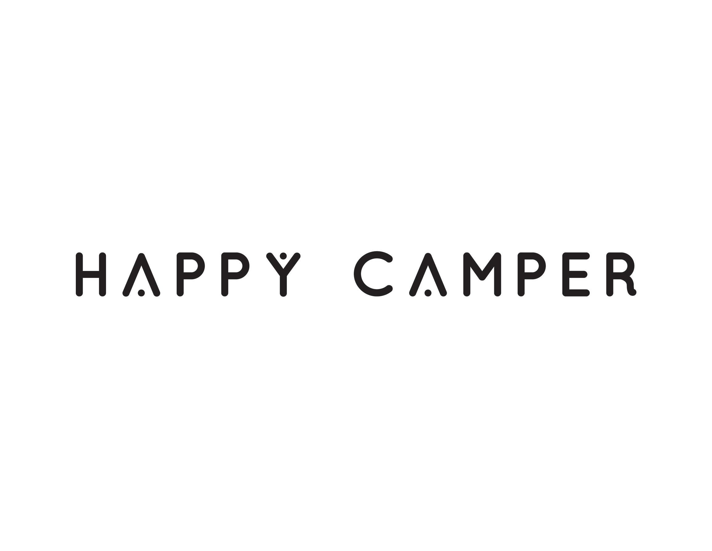
masthead design
I designed Happy Camper’s masthead to be modern yet playful. The dot in the Y creates a (happy) person and the dot in the A alludes to a person in a tent (camping).

establishing a system
Paragraph, character, and object styles, oh my! Happy Camper is not a one-time publication - it's a system for variable text. As such, I defined typography's rules and roles within the publication's larger conceptual information architecture.

visual language & art direction
Happy Camper's art direction is heavily influenced by my own personal experiences. For weeks, I sifted through my childhood nature journal drawings, edited old vacation photos, and found myself stopping randomly throughout my day to capture every interesting stump or colorful leaf I came across. This school assignment turned passion project really pushed me to seek inspiration in the world around me like I'd never done before.


prototyping
I tested paper sizes, weights, and textures until the publication's feeling matched that of its content and the care I’d taken to develop it.


Happy Camper Fall 2018


